I’m sure there are people who approached becoming an indie author with A PLAN and researched how to do it properly before they even started. I didn’t. I became a published author more or less by fluke, and when my publishers folded I found myself with several books and no ideas of what to do with them.
But my experience of publishers had not been good. Some of them give you terrible covers and bad edits. Some of them make morally questionable business decisions. Some of them fold your royalties up in so many shell companies you end up getting nothing and knowing less. The good ones go bust… To make a long story short, I didn’t want to resubmit my books to anyone else.
So, self publishing. I don’t claim to know what I’m doing here, but I am learning. For example, take the Cygnus 5 books – a space opera trilogy in which a disgraced female starship captain and war hero is shipwrecked on a penal planet and decides she is absolutely DONE. She’s fed up of religious dystopias and capitalist dystopias and – with the help/hindrance of an alien doomsday device and some pirates – she’s going to build a utopia of her own.
Because I’d started off in Romance, the first cover I made for this looked like a badly made sci-fi romance:
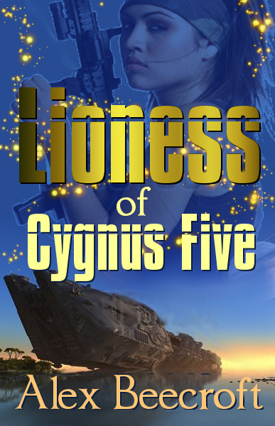
Spot the old pen name too. That’s my m/m romance pen name. I was trying to get my m/m romance fans to buy SF/F in which there is a low-key het romance. Why on earth I thought that would work, I don’t know. It must surely be a better idea to offer SF/F to people who like SF/F?
Eventually I did take a hard look at the cover and think, ‘It really doesn’t say science-fiction, does it?’ So at that point I made a new cover that looked like this:
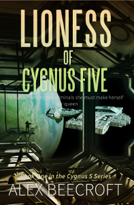
To be honest, I still quite like this one. But it is very dark and there’s no real sense of action, and it says ‘hard SF’ rather than ‘space opera.’ If readers of hard SF like the cover, they’re going to read the blurb and be put off. And there’s still the problem of the romance pen name.
Eventually, I took another look at this one and addressed one of those problems. I decided to make it more space opera.
Naturally, I did that by thinking back to the pulp SF of my youth – things like Andre Norton’s Forerunner Foray, which was a big influence on the ‘abandoned alien artifacts’ part of the story. I created the most pulp SF/space opera-y cover I could manage:
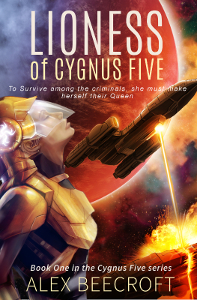
I’m still very fond of this one too. If I had seen that in the library when I was a teenager, I’d have snatched it off the shelf in a blink.
The trouble is, I was a teenager in the 70s/80s. It hadn’t occurred to me that this is not what book design looks like right now. Also, note that the pen name still has not changed.
Eventually (say what you like about how slow my process is – or how I ought to have done all this at the start – but I don’t rest until I’ve really thought something through,) I thought, ‘You know, maybe asking Romance readers to read SF is asking too much? Maybe I ought to be separating out my SF under a new pen name?’
Hence *waves a hand vaguely at the new website* Alex Oliver came into being. Initially, I simply changed the author name on the cover immediately above and re-released it.
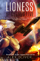
But then… FINALLY. FINALLY, OMG! it occurred to me to actually look at the covers of all the other books being sold as Space Opera. I put ‘space opera’ in the search bar on Amazon, and guess what I found? Pretty much every book in the top 40 had three things in common.
- Title in great big font – usually silver
- BLUE omg, every single book is blue.
- Spaceships – almost every one had a spaceship on the front.
I find that last thing cool, because exactly the same was true thirty years ago, although in those days they looked more like rocket ships.
So, after finally doing some market research I made two new mockups and asked people which one they liked best. 100% of people went for the one I liked least, which was – presumably not coincidentally – also the one that more closely matched the three points above.
I call that a very encouraging result. So here is the most up-to-date cover:
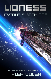
We’ll see how it does under this one, but I have to say I personally like it the best of all of them so far. I’m gently geeking out to have a cover like this, even if I did make it myself.
TL/DR?
What have I learned from this process that you can skip straight to and hopefully avoid the two years of experimentation to get here?
I suggest:
- Decide what genre your book belongs to and attempt to make it attractive to readers of that genre.
- Don’t try to sell your SF/F to Romance readers and vice versa. You may think that they will read it because they like your other work, but you would be wrong.
- It’s better to start off with a new pen name and no reputation than it is to try to overcome a reputation for the wrong thing. (ie, even if you’re a really good Romance writer, SF/F fans will see that as evidence that you can’t write good SF/F.)
- Before you make (or buy) cover art CHECK TO SEE WHAT’S SELLING NOW. You may think you know what a space opera cover looks like, but you could be just as wrong as I was.
How interesting! I love seeing the evolution of the cover process, since it’s usually invisible to us random souls browsing the bookshelves!
(I much prefer the “eighties” cover to the New Blue Cover, though.)
*G* Thanks! Yes, cover art is one of those things that seems to have a lot of unspoken rules about it that you only learn by first messing up. One of which is that you don’t want your book to stand out from all the other covers, because that will make your readers wonder if it really fits in the genre at all.
(I like the pulp SF one as well 🙂 It reminded me of Isaac Asimov’s Lucky Starr series when I did it. Oh and the EE ‘Doc’ Smith ones with the family of high G acrobats? That was the sort of feel I was going for on the inside too.